


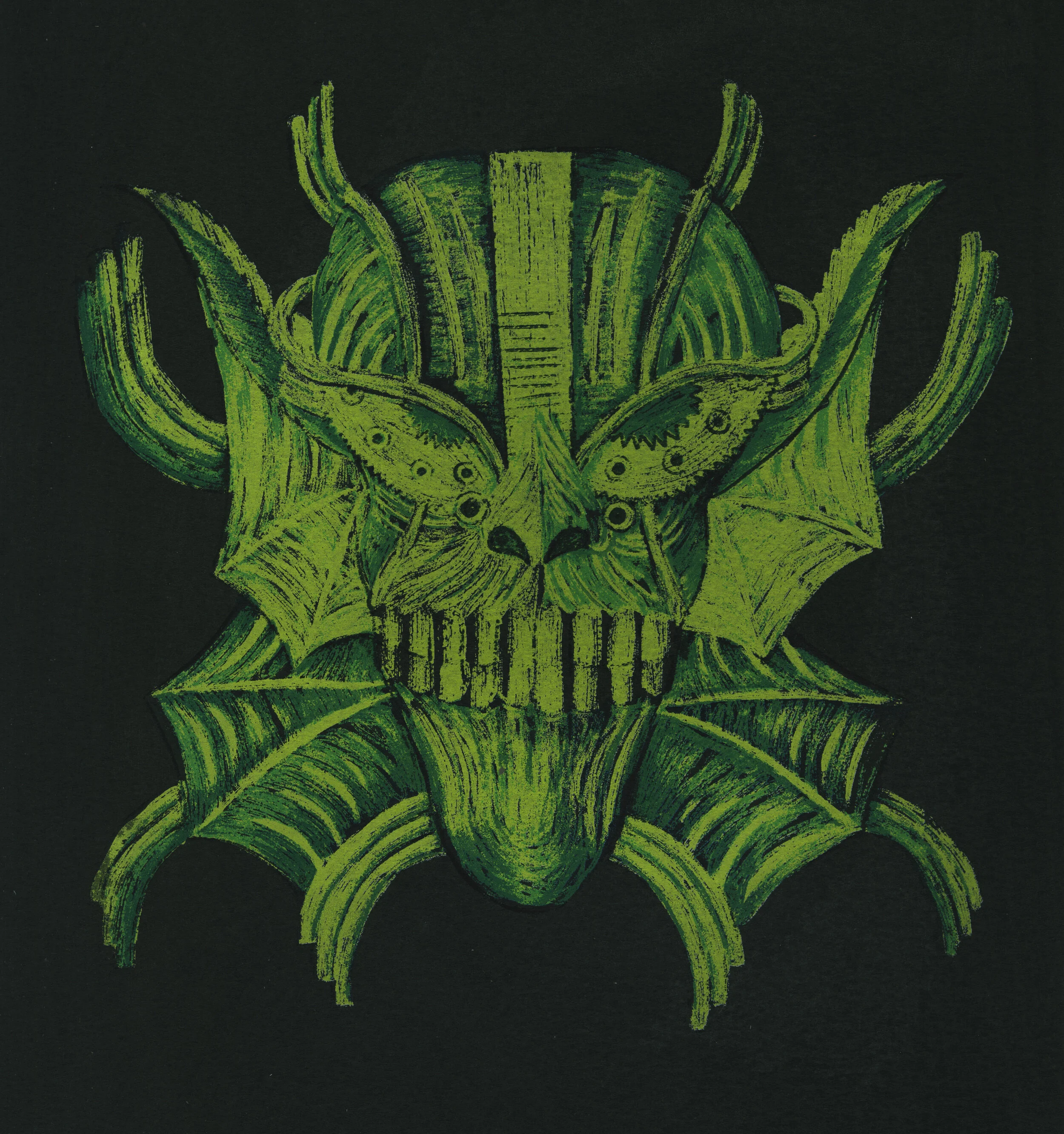


Illustration
motion graphics, traditional, digital
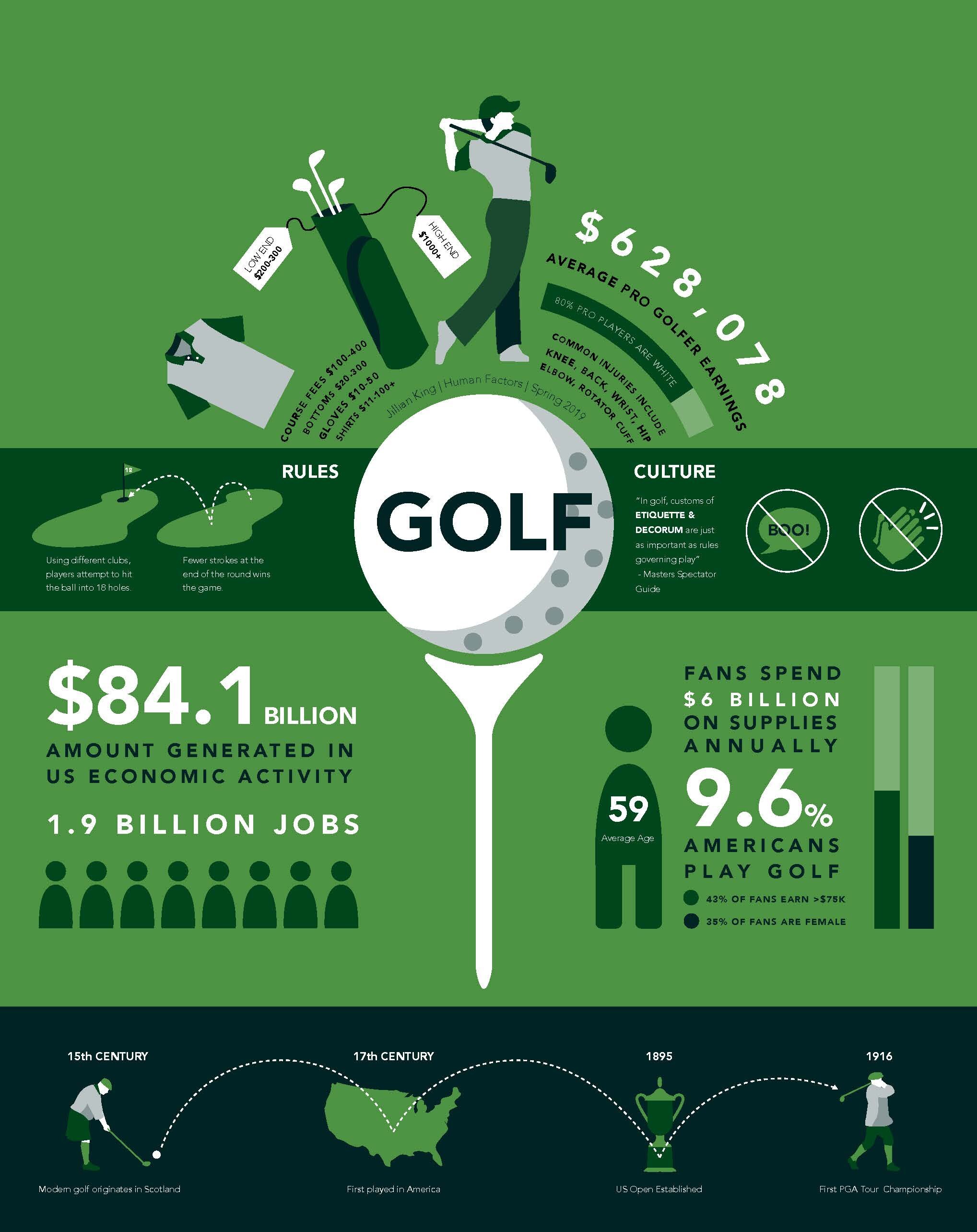


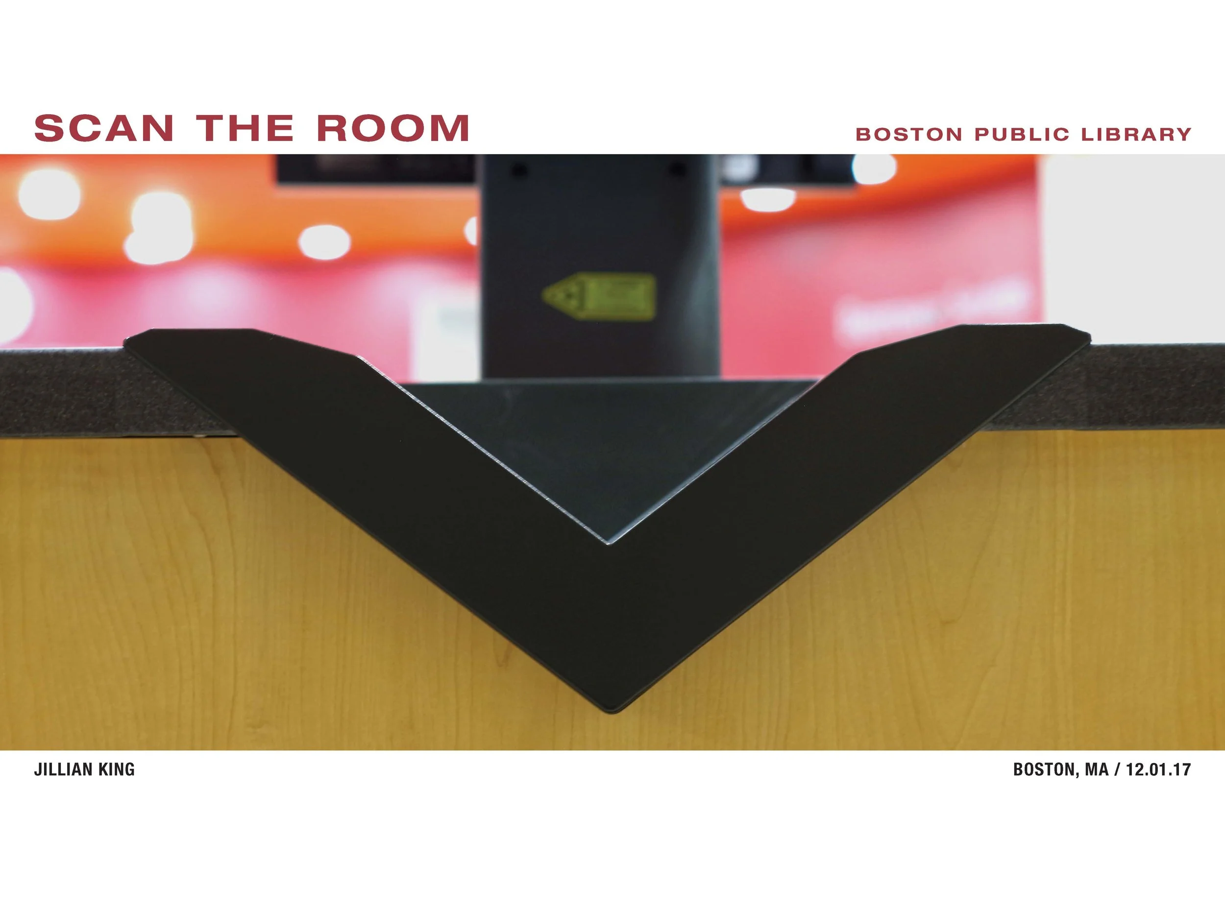


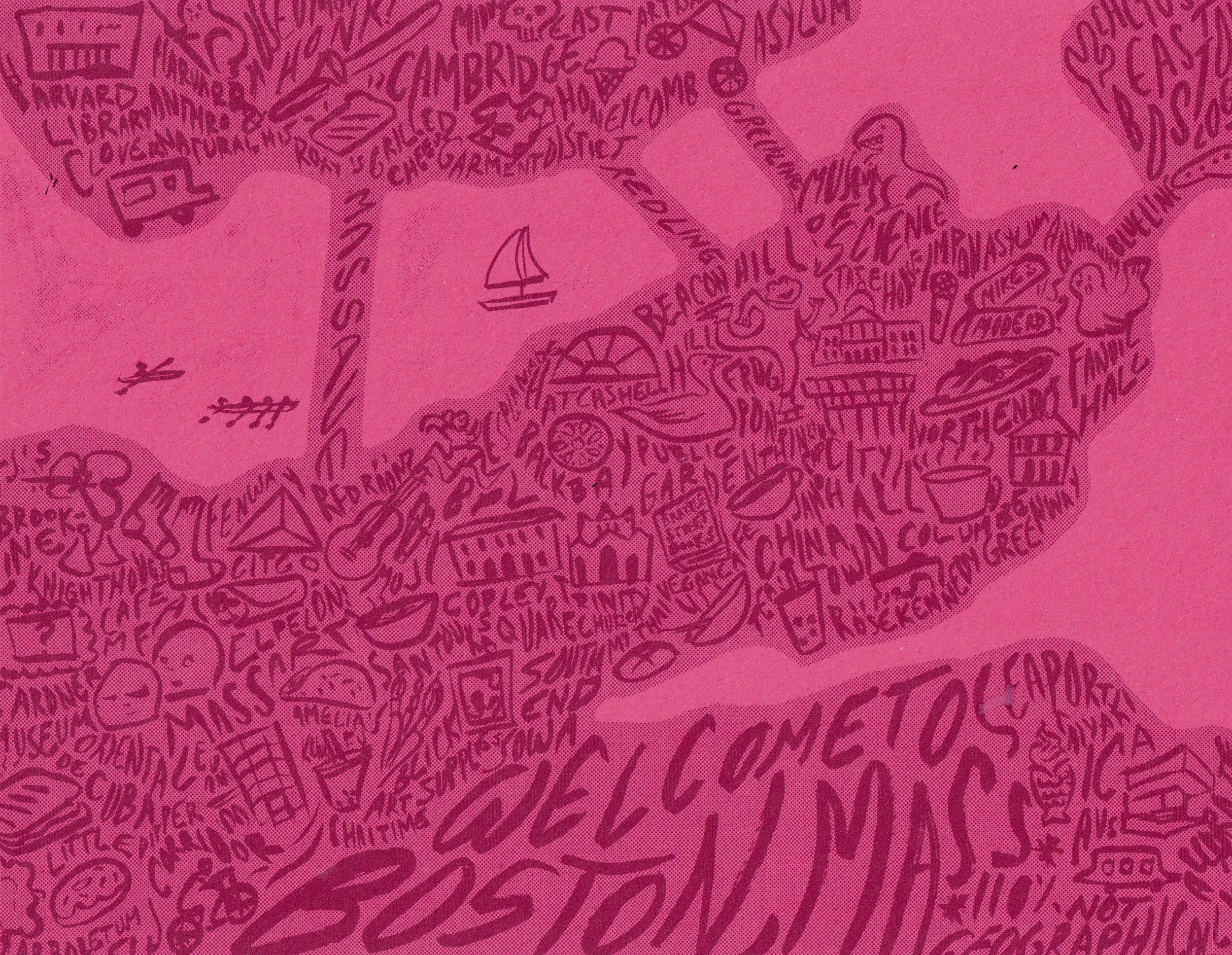
graphic design
typography, digital, web


Industrial Design
prototyping, fabrication, sketching, rendering, modeling